Borg City
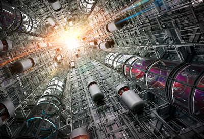
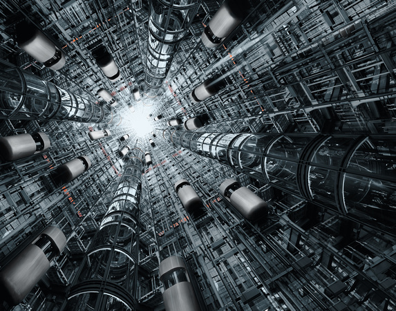
A while ago I did my Borg-City-Series, quite a bunch of work but fun creating the different perspectives and color schemes for this.
It all started here:
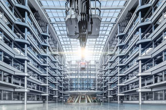
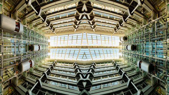
 This actually small atrium inside an office building has lots of technic-style silver faces and in the back three very futuristic looking elevators. Quite a few photographers loved to capture them, not only due to its organic looking shape of the elevators, also due to the colors of the elevator windows. Both gives the people some thinking about the existence of something unreal, something sci-fi. The picture above is just a panorama, put together of quite a few images to gain a very wide view. Here the focus is still on keeping the silver faces with its many details with some emphasizing of color in the middle with focus on the light reflex in the middle.
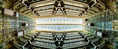
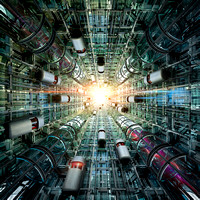
But in the end I was so attracted by that place, wishing to emphasize the elevators even more and moving the scenery from the real looking place to another scenery. So I came up with the following greenish images, actually the same but different ratios.
|
|
In big as a background paper spread over my four monitors it was looking amazing to my eyes. But still here, due to the focus on technical and sci-fy, the colors scheme was chosen carefully and still keeping the metal-like style. There are no big light reflexes or such things. This came with my next creations of that series.
|
|
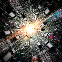
So there you can see other color schemes and lots of lights reflexes, birds flying into the exit in the middle, pulsating laser-beams in the additional elevator tubes. Also here the amount of walls with elevators has increased, actually now there are four such elevator walls, but by looking deeply you see there is a second level of the elevators in the middle, so the actual building is way taller. The PS-Image undercame a big increase in size. The first image of that edit-level (the left greenish one) was nice but not what I intended to do. Its too saturated and to much. So I chosed a more grayish color scheme, a different more dynamic looking perspective and was quite happy with the result. But not really satisfied with the result, still to much color, not enough dynamic and the eyes were still wandering without an idea by looking at the images. The eyes shouldn't focus on colors, rather on the structures, the big space inside this building and the things happening there. So the many details were nice but needed to be reduced for a more structured way the people look at the image and exploring the space.
So keeping a little bit of the angle of view, some more desaturation, with color keys marking the level of stages the elevators can go (the orange-red parts) plus one normal and one version with even more dynamic and finally I had the images I wanted to archieve. I really liked the sun in the exit but here I had to remove it.
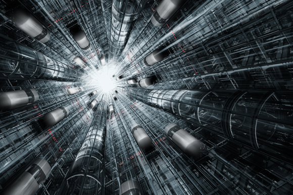
 It's been a longer learning process for me, to arrange everything correctly. Also I've realized some obious and some smaller ideas putting more dynamic into the image. Finally said it was not done just by putting the eight different walls with the three elevators plus the additional elevator tubes plus the light reflexes together. It was more a matter of balancing the colors with the perspectives the positionings of the moving elevators and getting a feeling of the image.
So for me the two greenish looking images, almost at the beginning plus these two last image were what I wanted to archieve, giving me ideas and possibilities for future work.
In the meanwhile there are licenses sold but in the end it's all a personal thing creating something I like!
